 Peel Tales
Accessibility
Color is never the only clue.
Distinct symbols, tactile shapes, strong contrast, focused hierarchy, Reduced Motion, and separate sensory controls keep the experience readable and comfortable.
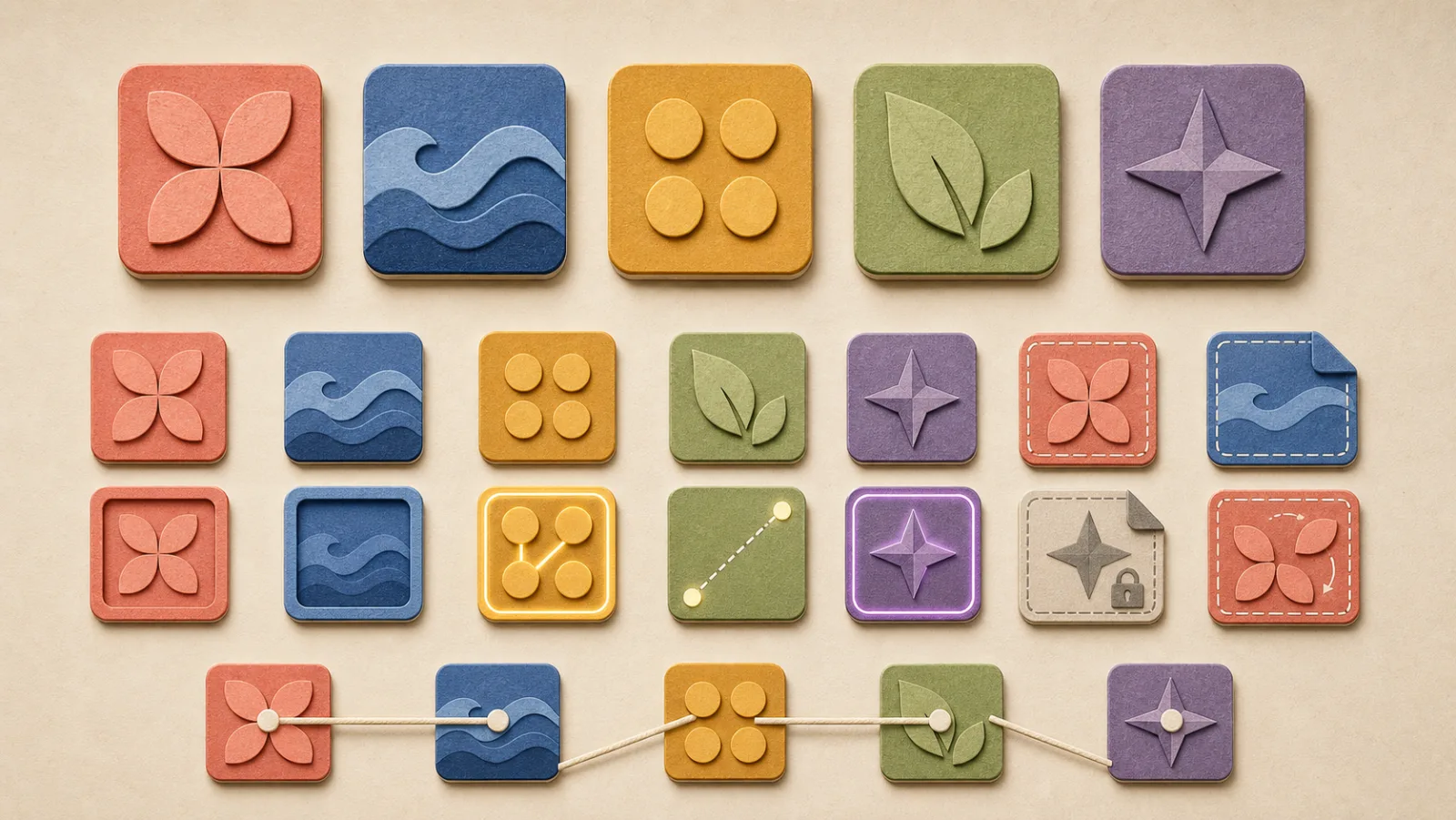
Five families, five symbols
Every tile reads by shape as well as color.
Four-petal form
Three-wave form
Four-dot form
Leaf form
Four-point star form
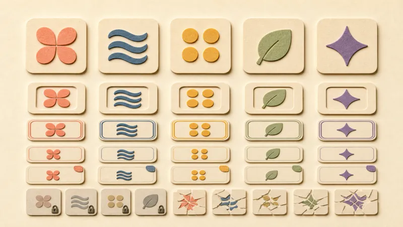
Consistent states
Feedback should explain, not distract.
Idle, pressed, selected, linked, valid diagonal candidate, invalid, resolving, locked, damaged, and objective states all preserve the same geometry and material system. Overlays stay inside tile bounds.
Comfort by design
Every lift, thread, and sound has a reason.
Reduced Motion
Reduced Motion keeps the meaning while removing ornamental movement.
Independent controls
Music, effects, haptics, and language are tuned separately from each other.
Safe-area & contrast
Safe-area layout and strong text/background contrast are explicit quality gates.
This page follows the same standard: keyboard navigation, visible focus, semantic
structure, sufficient contrast, and full prefers-reduced-motion support.